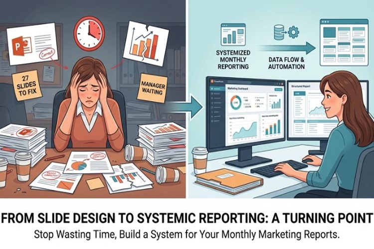
I didn’t realize how much time I was wasting on monthly reporting until one specific Monday.
I had 27 slides to fix, a broken chart layout that refused to align properly, and a manager waiting for updates that “should only take a few minutes.” But anyone who has built marketing reports knows the truth—it’s never just a few minutes.
That month was the turning point. I stopped treating reporting as slide design work and started treating it as a system problem.
The Real Issue Behind Monthly Marketing Reports
Most teams think reporting problems come from data complexity. In reality, it’s usually structure.
You can have perfect numbers from Google Ads, Meta campaigns, and CRM dashboards—but when everything gets dumped into PowerPoint without a framework, the story disappears.
What I kept seeing was:
- KPI slides rebuilt from scratch every month
- Random visual styles depending on who built the deck
- No consistent flow from “performance” to “insights”
- Too much time spent formatting instead of analyzing
And honestly, that last one hurt the most. Because reporting was supposed to help decision-making, not delay it.
When Templates Stop Being “Design Tools”
At some point, I stopped looking for “pretty slides” and started looking for structure I could reuse.
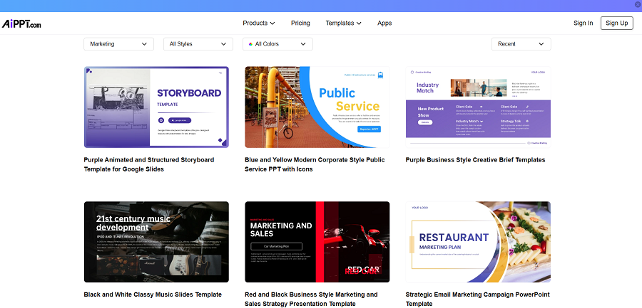
That’s when I came across a set of structured systems for reporting decks, which completely changed how I approached monthly updates.
If you’re dealing with repetitive reporting work, starting with a structured system like these
powerpoint templates free download
can save a surprising amount of time—not just in design, but in how you think about data presentation itself.
The difference is subtle but important. Instead of rebuilding every report, you’re now updating a framework that already knows where KPIs, insights, and comparisons belong.
That shift alone reduced my reporting time by more than half.

Why Most Marketing Reports Fail to Communicate Clearly
Here’s something I’ve noticed after reviewing dozens of marketing decks:
Most reports don’t fail because they lack data. They fail because they lack hierarchy.
Everything is presented at the same visual level. CTR sits next to revenue. Impressions sit next to ROI. Nothing stands out.
So stakeholders end up asking:
- “What am I supposed to focus on here?”
- “Is this good or bad?”
- “What changed since last month?”
A strong monthly report should answer those questions before they’re even asked.
That’s why structure matters more than visuals.
What a Real Reporting Structure Looks Like
A practical monthly marketing report usually follows a simple logic:
1. High-Level KPI Summary
Start with the “health check”:
- Revenue
- Conversion rate
- Cost per acquisition
- ROAS
No clutter. Just signals.
2. Channel Breakdown
This is where performance differences become visible:
- Paid Search
- Social Ads
- Email Campaigns
- Organic Traffic
3. Campaign Insights (Not Just Numbers)
This is where most teams miss the opportunity.
Instead of listing performance, you explain it:
- What improved
- What dropped
- Why it happened
4. Action Plan
If the report doesn’t lead to decisions, it’s just documentation.
The Shift From Manual Work to Repeatable Systems
I used to think faster reporting meant better tools.
But the real improvement came from consistency, not tools.
Once I switched to structured layouts, I noticed something interesting: I stopped redesigning slides and started actually thinking about marketing performance.
Even small improvements added up. A standardized KPI slide here. A reusable campaign layout there.
Eventually, reporting stopped feeling like a monthly headache.
Why Teams Are Moving Toward Structured Presentation Systems
The modern marketing environment moves too fast for manual reporting workflows.
When every month requires rebuilding slides from scratch, teams lose valuable time that could be spent on analysis or optimization.
That’s why structured presentation systems are becoming more common—not because they look better, but because they scale better.
Platforms like AiPPT organize this idea into reusable frameworks that support real marketing workflows instead of generic slide design.
You can explore different formats and structures here:
ppt templates
These aren’t just slide designs—they’re reporting frameworks built around how marketing teams actually work.
A Small Example That Changed My Workflow
One thing I didn’t expect was how much mental energy I saved.
Before using structured templates, every report started with a blank page. Every KPI layout was a decision. Every chart placement required adjustment.
After switching, the structure was already there.
That meant I could focus on questions like:
- Why did conversions drop this month?
- Which channel is becoming more efficient?
- Should we shift budget next cycle?
Not “how do I align this box?”
And that changes everything.
What Good Marketing Templates Actually Do Differently
Not all templates are useful. Some are just visual decoration.
The ones that actually improve reporting tend to include:
- Pre-built KPI dashboards
- Channel comparison layouts
- Campaign breakdown structures
- Insight-driven summary sections
But more importantly, they enforce consistency.
That consistency is what makes month-over-month comparison actually meaningful.
The Hidden Benefit Nobody Talks About
There’s another advantage that doesn’t get mentioned often.
Structured reporting improves communication between teams.
When everyone reads the same layout every month, discussions become faster and more focused. You don’t waste time re-explaining where data is or how it’s calculated.
Instead, conversations move directly to strategy.
Final Perspective
If I had to summarize everything I’ve learned about monthly marketing reports, it would be this:
Good reporting isn’t about better slides. It’s about better structure.
Once the structure is stable, everything else becomes easier—analysis, storytelling, and decision-making.
And if you’re still rebuilding your reports from scratch every month, that’s usually the real bottleneck.
Not the data. Not the tools.
Just the lack of a repeatable system.
Note: The content on this article is for informational purposes only and does not constitute professional advice. We are not responsible for any actions taken based on the information provided here.