
Ask any L&D leader what keeps them up at night, and retention will be near the top of the list. Not headcount retention. Learning retention. We invest weeks designing a leadership program, we watch participants nod along in the room, and then eight weeks later the frameworks have quietly evaporated. The manager who could recite the five behaviors of a cohesive team on Friday is back to firefighting by the following Wednesday.
It is tempting to blame this on busy schedules or weak follow-up. Those matter. But a large part of the problem sits further upstream, in how the material was encoded in the first place. Most leadership content arrives as prose and bullet points, delivered verbally and read from slides. That means it enters the brain through a single channel. When a concept is stored along only one route, it has only one path back out, and that path is fragile.
What visual thinking actually changes
The learning science here is not exotic. Dual coding theory, developed by Allan Paivio, holds that we process and store information through two distinct systems, verbal and visual, and that material encoded through both is recalled more reliably than material encoded through either alone. Cognitive load theory adds a second reason: working memory is narrow, and a well-designed diagram offloads relational information onto the page so the mind is freed to reason rather than to hold everything in suspension.
Put plainly, when a manager both hears an idea and sees its structure, they build two mental handles on it instead of one. Visual thinking is simply the discipline of making that structure explicit rather than leaving it implicit in the words.
The important nuance, and the one most programs miss, is that not all visuals do the same job. Three formats show up constantly in leadership work, and they are not interchangeable.
A concept map shows relationships. It links ideas with labeled connections, so “psychological safety enables candor, which improves decision quality” becomes a visible chain of cause and consequence. It is the right tool when the goal is understanding how parts of a system influence each other.
A mind map shows hierarchy and association radiating from a single center. It is excellent for individual reflection, brainstorming, or unpacking one role into its facets, but it deliberately avoids the cross-links that make a concept map so useful for reasoning about systems.
A flowchart shows sequence and decision. It answers “what happens, in what order, and what do I do if the answer is no.” It suits process and escalation work, and it is the wrong tool for capturing a web of mutual influence.
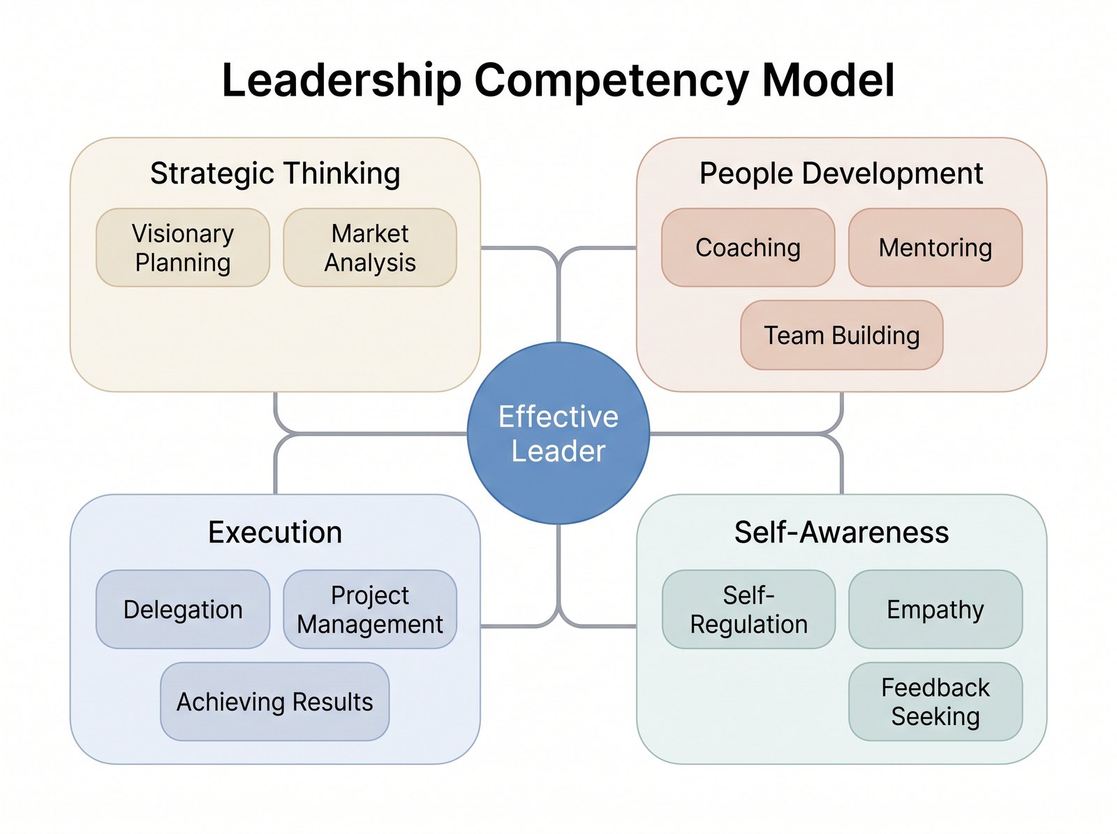
Matching the format to the thinking is where facilitators add real value. Reach for a flowchart when the answer is a procedure, and you flatten a rich leadership concept into a checklist. Reach for a concept map when you need shared understanding, and suddenly a room full of people can see the same system.
Three places it earns its keep
The strategy alignment workshop. Leadership teams routinely believe they agree on priorities, and on what “good leadership” looks like here, until they are asked to draw them. Have the group build a shared conceptual framework, mapping how the year’s strategy connects to the competencies the organization actually rewards, then compare where people placed the links. The disagreements that surface on paper are the ones that would otherwise have cost you a quarter. Building the framework together is the alignment; the artifact is just the residue. This is one setting where a conceptual framework generator earns its place, letting a facilitator turn the room’s spoken links between strategy and capability into a clean, projectable framework in real time rather than losing momentum redrawing by hand.
The new-manager 30-60-90. First-time managers are drowning in new relationships and unspoken expectations. A visual plan that maps stakeholders, early wins, and the behaviors that build credibility gives them a structure they can actually hold in their head. Because it is visual, they can pin it up and glance at it, which is exactly the kind of retrieval that keeps learning alive between sessions.
The retrospective. Most debriefs produce a list of observations that no one revisits. Mapping what happened as a cause-and-effect diagram forces the team past symptoms toward the relationships driving them. Seeing that a missed deadline traces back to an unclear decision right, not to individual effort, changes the conversation from blame to system.
Getting started without overhauling anything
You do not need to rebuild your curriculum to bring visual thinking in. Start with a single, well-chosen intervention.
Pick one module where participants consistently struggle to retain the model, and add a mapping exercise where they construct the visual themselves. The construction is the learning; a diagram you hand them is far weaker than one they build. Teach your facilitators the three-format distinction so they choose deliberately rather than defaulting to whatever the slide template offers. Ask participants to leave with their own map, not a polished corporate one, because the messy personal version is the one they will actually reuse.
Keep the tooling light at first. A whiteboard or a shared canvas is enough to prove the value before you invest in anything more; tools like ConceptViz are worth reaching for once you want participants to keep and revisit their maps between sessions rather than photograph a wall and forget it.
For L&D leaders weighing where to put limited design effort, the practical move is this: treat visual structure as part of encoding, not decoration you add at the end. The programs that stick are rarely the ones with the most content. They are the ones that gave managers a second way to hold what they learned, so that when the pressure comes on Wednesday, there is still something there to reach for.