
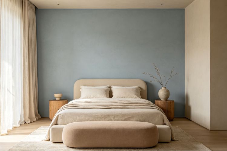
Silver Mist 1619 from Benjamin Moore is a light blue-gray that promises calm without going cold. But “blue-gray” covers a lot of ground, and what you see on the chip isn’t always what you get on the wall. Here’s what I found after painting my bedroom and bathroom.
What Is Silver Mist 1619?
Silver Mist is a soft, light blue-gray from Benjamin Moore’s classic color line. Its LRV is around 62, making it bright enough to keep a room feeling open but colored enough that it reads as more than just a white with a tint.
On the wall it looks like a cool, silvery blue with just enough gray to stay quiet. It’s the kind of color that makes a room feel like early morning — soft and still. Not dramatic, not boring. It works especially well in bedrooms and bathrooms where you want a calm, clean feeling without going stark white or dark gray. I’ve also seen it used beautifully on kitchen cabinets.
What Undertones Does It Have?
Blue is the main event. Silver Mist’s primary undertone is a clean, cool blue — not teal, not periwinkle, just straight blue. A secondary gray mutes it and keeps it from looking like a kid’s bedroom. In some lighting you might catch the faintest hint of green, but blue runs the show.
I checked it on Paintuma against a true neutral gray on the same wall, and the blue was unmistakable. Silver Mist is not a gray with a hint of blue — it’s a blue with enough gray to behave politely. If you want something that reads gray-first and blue-second, keep looking. The blue will show.
How Does Silver Mist 1619 Look in Different Lighting?
North-facing rooms actually suit Silver Mist well. Cool light plays into the color’s natural character, and it reads as a serene blue-gray that feels intentional rather than sad. This is a color built for cooler conditions.
South-facing rooms warm it up. The blue softens, the gray steps forward, and Silver Mist reads closer to a neutral gray with a blue tint. Still pretty, but less distinctly blue than the north-facing version.
Under warm incandescent bulbs at night, it shifts slightly toward a soft lavender-gray. Under cool LEDs, the blue stays crisp and true. If you want maximum blue, stick with cool-white bulbs. If you want a mellower evening read, warm bulbs take the edge off nicely.
How Does It Compare to Quiet Moments?
Quiet Moments is the other light blue BM fans recommend alongside Silver Mist, and they do share a family resemblance. Both are soft, light, and calming. But the undertone split matters.
Quiet Moments has a noticeable green undertone. It reads as a blue-green-gray — more sea glass, more coastal. Silver Mist skips the green and stays in pure blue-gray territory. Cooler. Cleaner.
If you want warmth and a slightly organic feel, Quiet Moments is the friendlier choice. If you want a crisper blue-gray that stays clearly on the blue side, Silver Mist is more direct about what it is. I find Silver Mist easier to pair with cool-toned decor and, oddly, less fussy next to warm wood tones — the clean blue just reads as contrast rather than conflict.
Does Silver Mist 1619 Work for Exteriors?
It can, but manage your expectations. Light blue-grays read lighter outside, and in direct sun Silver Mist will look closer to a blue-tinted white than the distinct blue-gray you see indoors. The blue won’t vanish completely, but it’ll be subtler.
Where it works best outside is on trim, shutters, or a front door — places where it sits next to a contrasting body color and gets to be the accent. As a full siding color it’s a soft, inoffensive choice — think coastal cottage — but make sure it still reads blue enough on your surface to justify picking it over a plain light gray.
Paint a large exterior test patch and check it in full sun and in shade. The difference can be dramatic.
What Trim Colors Pair Best?
White trim is the natural partner, and you have two good directions. A crisp white like Chantilly Lace gives you clean contrast and makes the blue-gray pop. A warmer white like Simply White OC-117 softens the transition and keeps the room from feeling clinical.
I tried both on Coloraw — Silver Mist 1619 — and toggled between them in different lighting. Chantilly Lace looked sharper and more modern. Simply White felt calmer and more blended. Both work — your call depends on how much you want the trim to stand apart from the wall.
Avoid creamy or yellow-toned whites. They fight the blue undertone and make everything look confused.
What Are the Closest Matches From Other Brands?
Sherwin-Williams Sleepy Blue is probably the closest SW match I’ve found. It’s a light blue-gray in a similar range, though it reads slightly more saturated — a touch more obviously blue, a touch less gray. Close enough to consider, different enough to need a sample.
Behr’s closest light blue-grays tend to lean either more overtly gray or flatter than Silver Mist. The balanced blue that makes Silver Mist feel alive on the wall is partly the BM formula’s doing — lighter blues especially benefit from the pigment depth. If you’re shopping Behr on a budget, sample a few of their light blues side by side with Silver Mist and see which one holds up.
Light blue-grays are a crowded category across every brand, but this specific balance of clean blue and muted gray is harder to replicate than it looks.
Should You Sample Silver Mist 1619 First?
Every time. Blue-grays are deceptive because the balance between blue and gray shifts so much with the light. A color that looks perfectly gray-blue at the store can read straight-up blue on your bedroom wall at 3 p.m.
Paint a large swatch — at least a foot square — and live with it through a full day. Morning, afternoon, evening lamps. Hold it against your bedding, your flooring, and anything staying in the room. If you want a quick digital preview before ordering a physical sample, try paintcolorvisualizer.com — it’s free, you upload a photo of your room, and you can see the color on your own walls. Works for both interior and exterior checks.
Bottom line: Silver Mist 1619 is a clean, cool blue-gray that’s calming without going cold. It works best in bedrooms and bathrooms, pairs well with crisp white trim, and absolutely needs a sample in your actual room first.
Note: The content on this article is for informational purposes only and does not constitute professional advice. We are not responsible for any actions taken based on the information provided here.