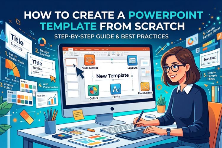
Building a PowerPoint template is one of those tasks that sounds tedious until you realize you have rebuilt the same slide layout from scratch eleven times in the past six months. That is not an exaggeration — that was my actual situation before I sat down and spent a focused afternoon setting up a proper .potx file. Since then, I have not touched font settings or repositioned a logo once.
This guide is the one I wish I had found that afternoon.
The Problem With How Most People Use PowerPoint
Open a blank deck. Pick something from the default theme gallery. Spend 15 minutes changing the blue to your company’s blue. Forget to update the slide master. Wonder why slide 7 looks different from slides 1 through 6.
Sound familiar?
The root issue is almost always the same: people design presentations at the slide level instead of the template level. Fixing a font on one slide does not fix it everywhere. Moving a logo on the title slide does not move it on the content slides. Every manual formatting decision you make directly on a slide is a decision you will have to make again on the next deck.
A properly built template eliminates that loop entirely. You make the decisions once — in the slide master — and every slide in every deck inherits them automatically.
Before You Open PowerPoint, Gather These Three Things
Skipping this step costs time later. Trust me on this.
Your exact brand hex codes. Not “kind of navy blue.” The actual value — #1A3C6E or whatever it is. Approximate colors look fine on your monitor and fall apart on a projector or in print. If you do not have a brand guidelines document, ask your design team or pull the values directly from your company website using a browser color picker tool.
Your font names. Both of them — heading font and body font. Custom or licensed fonts need to be installed on every machine that will use the template, or substitution will kick in and scramble your carefully planned hierarchy. If your company uses a font that is not widely distributed, note that in whatever documentation you share with the template file.
A clean logo file. PNG with transparent background. Not JPEG — a white-background JPEG logo on a colored slide looks like a mistake, because it is. If you only have a JPEG, ask for the original source file. This is worth a five-minute conversation with whoever manages your brand assets.
Step 1: Go Straight to Slide Master View
View > Slide Master. Do not pass Go, do not start editing regular slides.
The left panel shows two tiers: one large master slide at the top, and a row of smaller layout slides beneath it. The master slide is universal — anything you place there appears on every slide in the deck. Layout slides are variations: Title Slide, Title and Content, Two Content, Blank, and so on.
Most people never open this view. That is why most presentations look inconsistent three slides in.
Step 2: Define Theme Fonts First
Slide Master tab > Fonts > Customize Fonts. Assign your heading font and body font here.
Why this matters practically: I once inherited a 74-slide deck where someone had manually set the font on every individual slide. When the brand font changed, updating that deck took four hours. A deck built on a proper theme font pair takes four seconds — change the theme font once, every slide updates.
Set it at the theme level. Always.
Step 3: Build Your Color Palette in the Theme
Slide Master tab > Colors > Customize Colors. You will see slots for background colors, text colors, and six accent colors.
The accent colors are what drive charts, SmartArt, tables, and data visualizations. Set these to your actual brand colors and every chart a colleague drops into the deck will use brand colors by default instead of PowerPoint’s default blue-orange-gray sequence.
A small thing that makes a large difference in how professional the final presentation looks, especially when slides get handed off between team members.
Step 4: Design the Master Slide Background
Still on the master slide — right-click anywhere on the slide canvas, select Format Background.
For most business contexts, a white or very light neutral background works across the broadest range of scenarios: projection, print, screen sharing on video calls, PDF export. Bold dark backgrounds look striking in a designed deck but create friction when someone needs to print the slides as handouts.
If your brand genuinely calls for a dark theme, consider building it as a specific layout rather than the universal default. That way, presenters have access to both options without fighting the template.
Add persistent elements here: a thin accent line along the bottom edge, a subtle brand mark in a corner, a footer bar. Whatever lives on the master slide will appear on every slide automatically.
Step 5: Insert the Logo on the Master Slide
Insert > Pictures > find your PNG file.
Position it where it belongs — typically a top-right or bottom-left corner. Keep it small enough that it does not compete with slide content; 80 to 120 pixels tall is usually appropriate for a standard widescreen slide.
Right-click > Send to Back so it sits behind all content placeholders. Presenters who build image-heavy slides can suppress background graphics on individual slides via Format Background > Hide Background Graphics without altering the template itself.
Step 6: Set Placeholder Formatting
Click into a text placeholder on the master slide, select all the text, and set your formatting hierarchy. A functional starting point for business presentations:
Slide titles: 32 to 36pt, heading font, primary brand color
Body text, first level: 20 to 22pt, body font, near-black
Body text, second level: 17 to 18pt, body font, medium gray
Body text, third level: 14 to 15pt, body font, lighter gray
Nothing below 14pt in the master. If a presenter needs smaller text for a complex data slide, they can override it on that specific slide. But the master should not force small text onto every slide by default.
Line spacing of 1.2 to 1.4 on body text makes slides significantly easier to read at projection distance. It is a detail that separates templates people actually enjoy using from ones that technically work but feel cramped.
Step 7: Trim and Rename Your Layouts
PowerPoint ships with 11 default layouts. Most decks use four or five. Delete the ones your team will realistically never touch — “Vertical Title and Text,” for instance, is a layout that survives mostly out of inertia.
The core layouts worth keeping and refining:
A title slide layout for the opening and closing slides. A section divider layout for breaking a long deck into chapters. A standard content layout as the main workhorse. A blank layout for full-bleed images, custom infographics, or anything that needs to escape the standard grid.
Rename each layout to something descriptive. “Section Divider” is more useful than “Title and Content 3” when a colleague is choosing a layout from the dropdown.
Step 8: Configure Slide Numbers and Footers
Most layout slides include footer, date, and slide number placeholders at the bottom. Move them to match your design. Set the font size and color — usually 9 to 10pt in a neutral gray — so they are present but not visually competing with content.
Build the placeholders in. Whether they display is a presenter’s decision via Insert > Header and Footer. What you control at the template level is that when they do display, they look intentional rather than default.
Step 9: Save as .potx
File > Save As > change file type to PowerPoint Template (.potx).
PowerPoint redirects the save location to the default Templates folder. For personal use, saving there is fine. For team distribution, save to a shared OneDrive folder, SharePoint library, or network drive and share the path with your team.
One important note: tell people to open the template via File > New > browse to the file, not by double-clicking the .potx directly. Double-clicking opens the template itself for editing. Opening via File > New creates a new deck based on the template, which is what you actually want.
If You Do Not Want to Build the Architecture From Zero
There is a legitimate shortcut here that I use regularly for client projects on tight timelines.
Starting from a well-structured existing template — one that already has a proper slide master, defined theme fonts, and clean layout hierarchy — and then customizing it with your brand values takes 25 to 35 minutes. Building the same structure from a blank file takes two to three hours the first time.
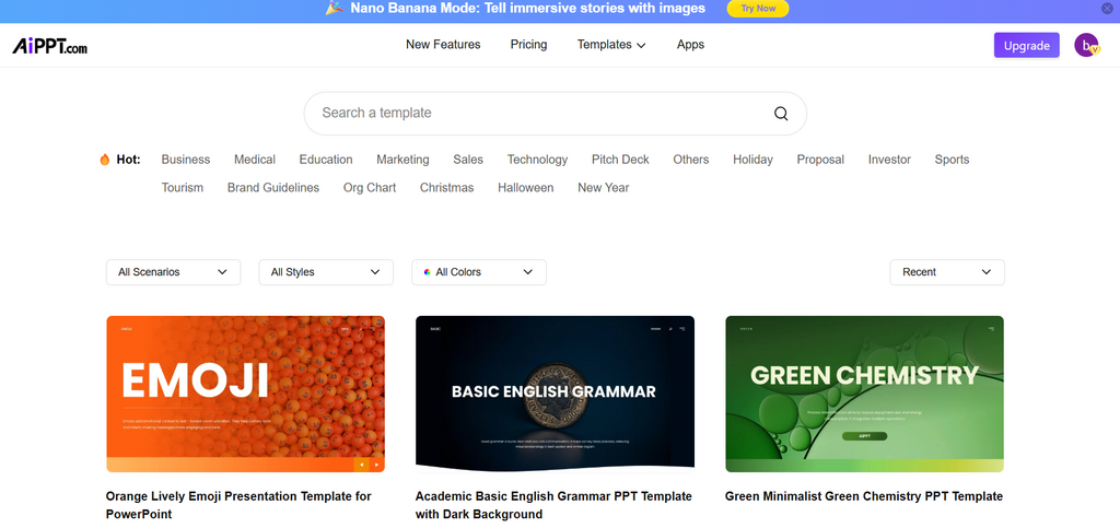
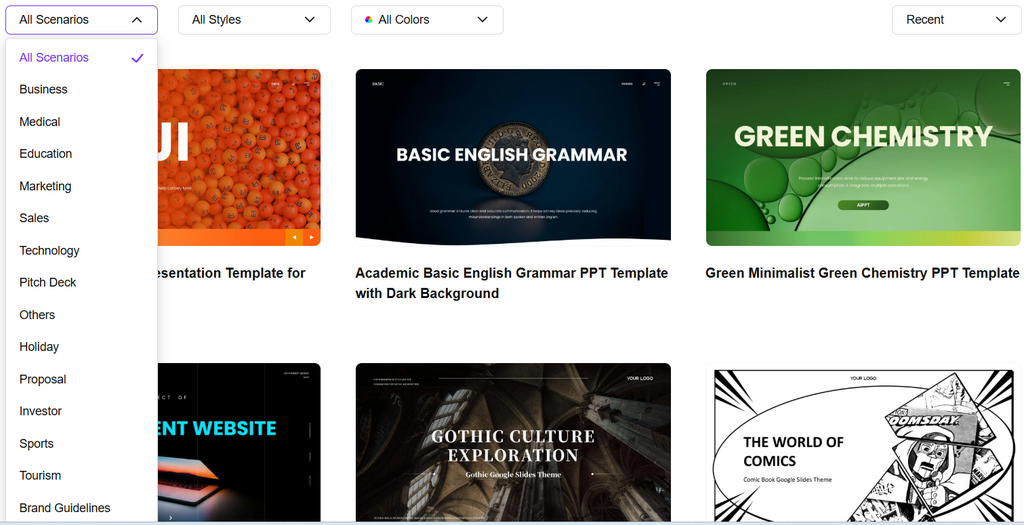
AIPPT’s library of powerpoint templates covers business, education, finance, marketing, and several other categories. The practical advantage over random templates you find via a Google image search is that these are built with actual slide master structures intact — the theme fonts are set, the layout hierarchy exists, the placeholders behave correctly. You can open one, go straight to Slide Master view, swap in your hex codes and fonts, replace the logo, and export a working branded template in a fraction of the time a from-scratch build takes.
Not every situation calls for building from zero. If the deliverable is a finished presentation and the deadline is tomorrow, start from a solid base.
The Mistakes That Actually Break Templates in Practice
Manually formatting individual slides instead of the master. I have seen experienced PowerPoint users make this mistake. The symptom is a deck where 80 percent of slides look consistent and 20 percent look slightly off — usually because someone formatted a handful of slides directly and never updated the master. If something looks wrong on multiple slides, fix it in the master. If it looks wrong on one slide, check whether that slide has manual overrides that are conflicting with the master settings.
Low-resolution logos. A PNG that looks fine at 100 percent zoom on a laptop screen looks blurry when projected on a 10-foot screen. If you do not have a high-resolution version of the logo, ask for one before building the template. Retrofitting a logo across a deployed template is more annoying than getting the right file before you start.
Too many accent colors. Six accent slots does not mean you should fill all six with different brand colors. Using more than three or four accent colors in charts and SmartArt creates visual noise. Constrain the palette even if your brand technically has more colors available.
Skipping the blank layout. Every template needs one. Full-bleed photography, custom diagrams, title cards with large display text — these all need a slide with no placeholders in the way. If the blank layout is missing, presenters will delete placeholder boxes manually on individual slides, which creates a mess in the file structure.
Test the Template Before You Share It
Build a 10-slide sample deck using every layout before distributing to a team. Add a chart on a content slide to verify the accent colors are pulling correctly. Check the title slide, a section divider, a two-column layout, and a blank slide. Project it or view it full-screen on a large display if you have access to one.
Catching a misaligned placeholder or a font that did not apply correctly before 30 people are working from the template takes five minutes. Catching it after is significantly more complicated.
One More Thing Worth Bookmarking
If you are the kind of person who likes having reference material ready — and if you present regularly, you probably are — keeping a shortcut to a reliable source of well-built slide designs is genuinely useful. AIPPT’s ppt templates library is worth having in your browser bookmarks for the moments when a project calls for a design direction you have not built into your standard template yet.
The template you build this week should handle 80 percent of what you present. The other 20 percent — a keynote with a different visual tone, a client proposal that needs a custom look, a training deck that needs something livelier — is where having a good external resource saves the afternoon.
Build the template. Set the master. Save the .potx. You will thank yourself six months from now when you open PowerPoint and everything is already exactly where it should be.
Note: The content on this article is for informational purposes only and does not constitute professional advice. We are not responsible for any actions taken based on the information provided here.